Plotting Matrices in R with Matplot is straightforward. In this post, I explore some basics of Matplot using a simple example data set of wind speeds.
Creating the Dataset
For my example, I made a simple data set of average wind speeds for the week by city.
Days <- c(“Mon”, “Tue”, “Wed”, “Thu”, “Fri”)
Cities_Factor <- c(“Chicago”, “New York”, “Los Angeles”)
# Speeds are in MPH
CHI_Speeds <- c(20,20,19,2,5)
NY_Speeds <- c(10,8,15,15,3)
LA_Speeds <- c(8,22,25,19,22)
Windspeeds <- rbind(CHI_Speeds, NY_Speeds, LA_Speeds)
colnames(Windspeeds) <- Days
rownames(Windspeeds) <- Cities_Factor
Windspeeds
The above prints out my matrix:

First Pass Plotting the Matrix with Matplot
I was able to find my way around matplot mostly just using the documentation. However, I did stumble on two tasks I wanted to accomplish:
- Adding the week days to the x axis.
- Supressing the numbers on the x axis after I added the weekdays.
I’ll explain how I accomplished these goals and show the various iterations of my plot until I got what I wanted.
To the first task, I found the following post https://stackoverflow.com/questions/43947466/how-to-add-weeknames-as-x-axis-values-in-matplot-r.
I didn’t see the “axes” option anywhere in the matplot documentation. I only later found what I was looking for by following the matplot documentation into plot docs, but the above Stack Overflow post definitely got me going.
So, to start, my graph looked as follows:
matplot(t(Windspeeds),col=c(3,4,9),type=”b”,pch=c(0,4,6),ylab=”Windspeed MPH”, xlab=”Day of Week”)
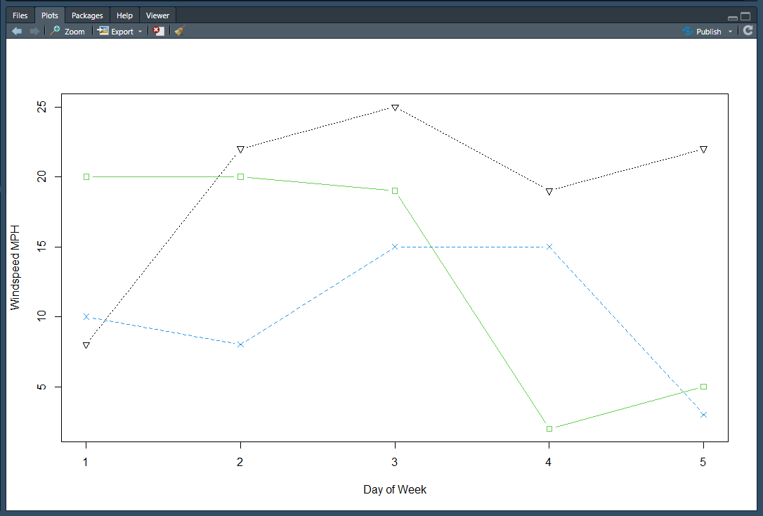
So, looking pretty good. Though, as noted above, I want the weekdays printed, and I also want a legend (which I’ll get to next). However, first, here’s a breakdown of the parameters I did specify:
- t(Windspeeds): I needed to transpose my matrix so that my graph is a function of wind speed and not the weekdays.
- col=c(3:4, 9): for the three cities, I chose three unique colors for the lines.
- pch=c(0,4,6): same as above…3 unique symbols (characters) for the point markers.
- type=”b”: this means I want lines and point markers in the graph.
- ylab and xlab: labels for the y and x axes
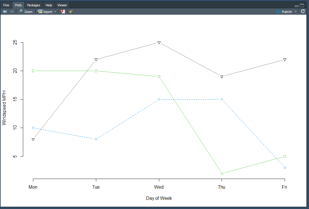
Adding the Weekdays to the Plot
Above, I referenced the Stack Overflow link I used to help me figure out how to print the weekdays on the x-axis. That is, use the axis() function:
axis(side=1, at=1:length(Days), labels=Days)

The problem with this solution is apparent though; the week day values are printed but so are the numerical ticks. Okay, so that led me to some additional searching that brought me to https://stackoverflow.com/questions/29253659/change-axis-labels-with-matplot-in-r.
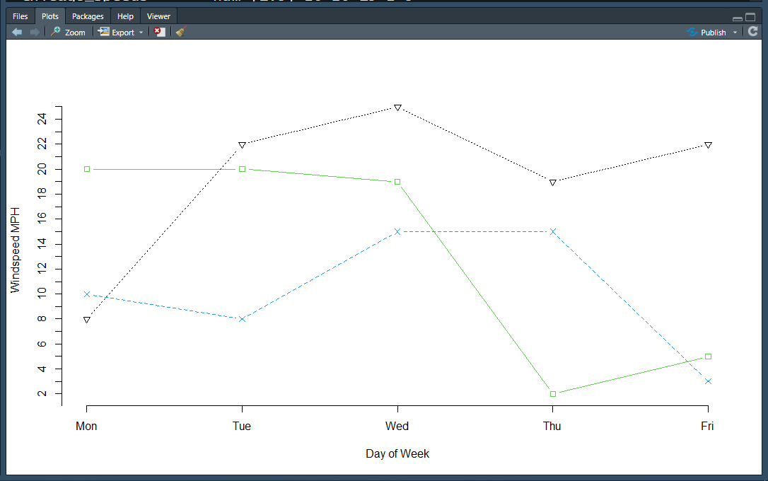
Those instructions led me to:
matplot(t(Windspeeds),col=c(3,4,9),type=”b”,pch=c(0,4,6),ylab=”Windspeed MPH”,
xlab=”Day of Week”, axes=F)
axis(side=1, at=1:length(Days), labels=Days)
axis(2)
The changes were to set axes to false in the matplot function call, and then implement the two axes as I needed. The plot is getting close to what I want now:
The only thing I don’t like now is the gap between the two axes. I was able to intuit the fix for this and adjusted the axis(2) invoke and force it to start at 0.
axis(2, at=0:max(Windspeeds))
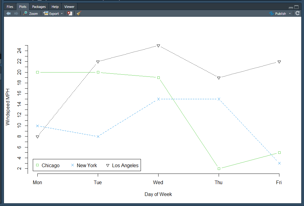
Final Product – Adding the Legend
The final step is to add the legend, which is done through the legend() function:
legend("bottomleft",inset=0.02, horiz=T,legend=Cities_Factor, col=c(3,4,9),pch=c(0,4,6))
What’s important here is that I specified the same col and pch parameters so that the legend matches the plot. Here’s the final product:
Categories: R Programming
Leave a Reply