This post focuses on how to deal with matrix subset plots with matplot in R.
I’ll start by setting up the demo data and then walk through a series of steps explaining how to work with with matrix subsets. I’ll specifically be discussing single level subsets and the side effect of matrix conversion to vectors.
Setting up the Matrix Data
To start this practice exercise, I create two matrices. The first matrix is average precipitation in inches over five years for three cities. The second matrix is average temperature in degrees Fahrenheit for the same three cities and date range. All of this data is fictitious.
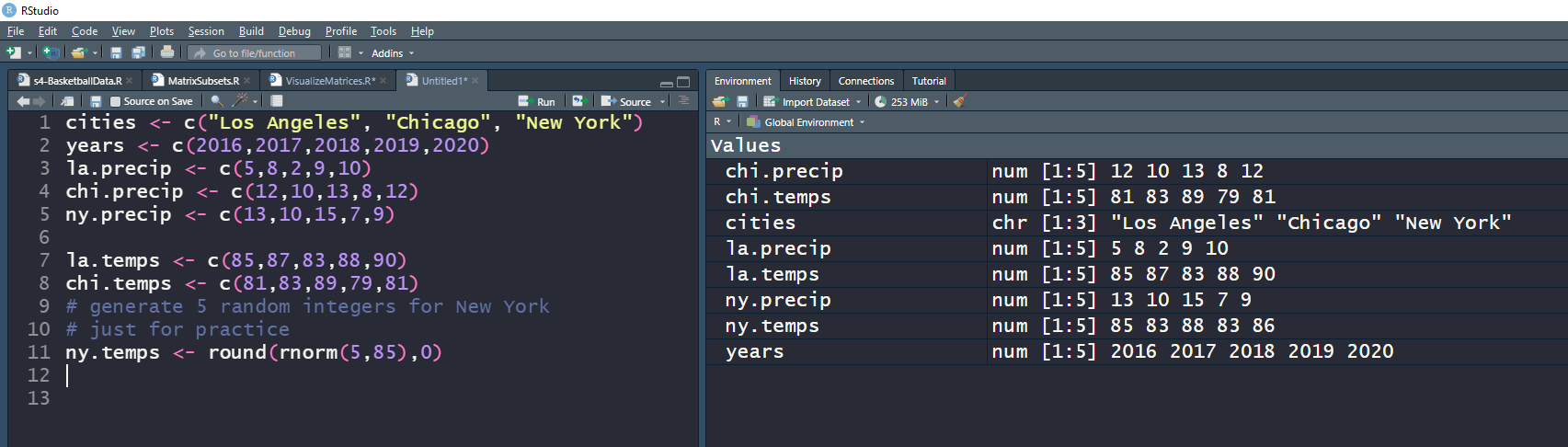
The definitions above specify the cities, precipitation, and temperature vectors needed to create the matrices. To combine the vectors, I used the following:
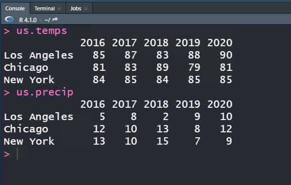
us.temps <- rbind(la.temps, chi.temps, ny.temps)
us.precip <- rbind(la.precip, chi.precip, ny.precip)
colnames(us.temps) <- years
colnames(us.precip) <- years
rownames(us.temps) <- cities
rownames(us.precip) <- cities
That code gives the following matrices:
Plotting the Data with Matplot in R
I covered the basics of plotting matrix data with matplot in R programming in this post. A similar approach is taken in this post.
Below are the two matplots visualizing the temperature data and precipitation data.
First is the temperature plot
matplot(t(us.temps), type=”b”, pch=c(1:3), col=c(1:3),
ylab=”Temperature (Fahrenheit)”, xlab=”Year”, axes=F)
legend(“bottomleft”, inset=0.08, legend=cities, pch=c(1:3),col=c(1:3))
axis(side=1, at=1:length(years), labels=years)
axis(2, at=0:max(us.temps))

Next is the precipitation plot:
matplot(t(us.precip), type=”b”, pch=c(7:10), col=(7:10),
ylab=”Precipitation (Inches)”, xlab=”Year”, axes=F)
legend(“bottomleft”, inset=0.08, legend=cities, pch=c(7:10), col=c(7:10))
axis(side=1, at=1:length(years), labels=years)
axis(2, at=0:max(us.precip))

Again, this is the same type of matrix plot demonstrated in the post referenced above. So, what about the single level subset plots, and why is that interesting?
Matrix Single Level Subset Plot
The primary point of this post is to demonstrate that not all matrix subsets are themselves matrices. This behavior is due to the fact that R is trying to be smart by “guessing” what you want when taking a matrix subset.
In particular, if you take a single level subset of a matrix:
east_coast.temps <- us.temps[“New York”,]
east_coast.temps
is.matrix(east_coast.temps)
is.vector(east_coast.temps)
R doesn’t think you want a matrix back. It thinks you want a vector:
> east_coast.temps <- us.temps[“New York”,]
east_coast.temps
2016 2017 2018 2019 2020
87 85 88 85 87
> is.matrix(east_coast.temps)
[1] FALSE
> is.vector(east_coast.temps)
[1] TRUE
From the above output, observe that the result set is a vector and not a matrix. Trying to plot this results in the following:
matplot(t(east_coast.temps), type=”b”, pch=c(7), col=(7),
ylab=”Temperature (Fahrenheit)”, xlab=”Year”, axes=F)
legend(“bottomleft”, inset=0.08, legend=east_coast.temps, pch=c(7), col=c(7))
axis(side=1, at=1:length(years), labels=years)
axis(2, at=0:max(east_coast.temps))

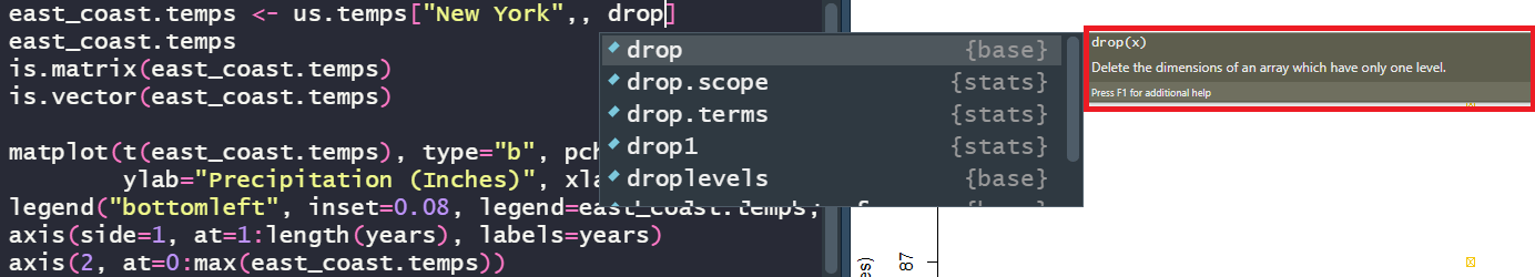
The plot is straight vertical because there is only a single dimension due to the conversion to a vector when the matrix subset was taken. To change this default behavior, the drop parameter can be added to the square brackets. This tells R to *not* delete dimensions when taking a single level subset of data from the matrix.
Note, I fix the legend from the plot above at the end by setting the legend parameter to legend=rownames(east_coast.temps)
The entire data structure and resulting matplot output change with this single switch.
east_coast.temps <- us.temps[“New York”,, drop=F]
east_coast.temps
is.matrix(east_coast.temps)
is.vector(east_coast.temps)
> east_coast.temps <- us.temps[“New York”,, drop=F]
> east_coast.temps
2016 2017 2018 2019 2020
New York 83 84 83 86 85
> is.matrix(east_coast.temps)
[1] TRUE
> is.vector(east_coast.temps)
[1] FALSE
See above, is_matrix is now TRUE while is_vector is now FALSE. As described, the plot is now as expected and shows the changes in temperature in New York over the years:
matplot(t(east_coast.temps), type=”b”, pch=c(7), col=(7),
ylab=”Temperature (Fahrenheit)”, xlab=”Year”, axes=F)
legend(“bottomleft”, inset=0.08, legend=rownames(east_coast.temps), pch=c(7), col=c(7))
axis(side=1, at=1:length(years), labels=years)
axis(2, at=0:max(east_coast.temps))

That concludes the notes on handling matrix subset plots with matlib in R programming.
Categories: R Programming
Leave a Reply