This post shares some basic knowledge on creating an R scatter plot with GGPlot2.
Read a File and Load ‘ggplot2’ Package
mydata <- read.csv(file.choose())
install.packages(“ggplot2”)
The first line of code opens an interactive plot allowing selection of file.
The second line of code installed the ggplot2 package.
In order to actually use the package, must check the checkbox in IDE “Packages” tab:

Creating a Scatter Plot with GGPlot2
For reference on this function, I found https://beanumber.github.io/sds192/lab-ggplot2.html to be a valuable resource.
I took the ggplot2 diamonds data set which has a “ranking of quality” and converted the rankings and labels just for practice.The data set now shows the price paid per pound of weight of a given ranking of some commodity. Ranking AA is better than BB, which is better than CC, which is better than DD, etc. So, .5 pounds of this commodity ranked at AA should cost more than .5 pounds of the same commodity ranked as a level “BB”. My challenge was to confirm the integrity of this pricing scale; are people always paying more per pound for the higher rank level?
I started with the following:
ggplot(data=mydata, aes(x=weight,y=price)) +
geom_point()
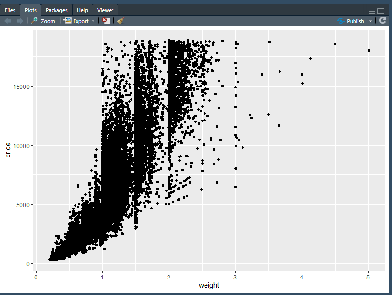
So, this doesn’t tell me much yet. Basically, I observe:
- The weight ranges from slightly over 0 pounds up through 5 pounds where 3 – 5 pounds are a bit of an outlier range.
- Price for this commodity, across these weights, ranges from somewhere over 0 dollars up through more than 15,000.00.
But, I cannot tell how the ranking (e.g. AA, BB, CC, etc.) influence this price-per-pound. I can alter my plot aesthetics to account for this:
ggplot(data=mydata, aes(x=weight,y=price, color=rank)) +
geom_point()

In the above image, the ranking is now included, and it’s looking like there is some truth that ranking impacts price per pound. Notice how the FF ranked items at 2 pounds appear below the EE rankings and so on.
Is it 100% always the case though; is higher rank per pound always more expensive than lower ranked at the same weight? Things are a bit too cluttered to tell.
Filtering and Smoothing the Scatter Plot
The first step to improving readability of this chart is to remove the outliers. After about 2.5 pounds, the data seems randomized and the spread is significant. These outliers can be filtered:
ggplot(data=mydata[mydata$weight<2.5,], aes(x=weight,y=price, color=rank))
+ geom_point()
The filter is [mydata$weight<2.5,]
Then, I added in smoothers by updating the ggplot call to include geom_smooth().
The final product is as follows.
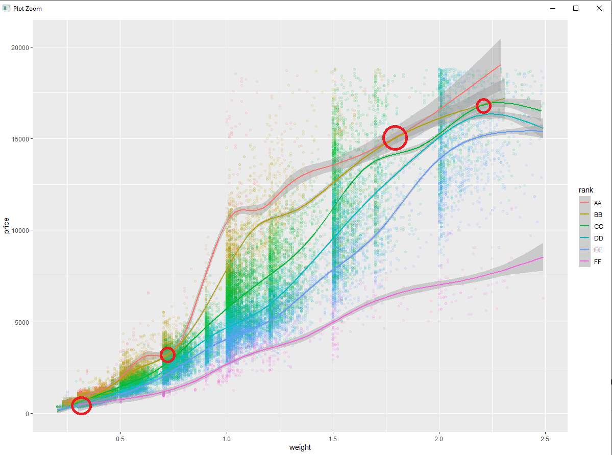
I added the red circles to highlight that there are some unexpected pricing issues. These are points where lower ranked instances of the commodity are selling for the same (or higher) price than the higher ranked instances. In a real scenario, this would call for investigation.
Categories: R Programming
Leave a Reply