The qplot function produces insightful visualizations even with limited data and arguments. I’ll demonstrate some basic graphs in this introduction post to R programming with qplot in ggplot2.
The ggplot2 library is required to use the qplot() function, t. Use the install.packages and library functions to make sure it is installed:
I’ll use the ChickWeight data set for this demonstration. This is loaded by running data("ChickWeight").You can find the docs online.
Absolute Basics qplot Chart
A useful visualization is to see the weight distribution for all of the chickens on a given diet. To get that for diet 1, I will:
- Build the filter
- Call qplot
filter <- ChickWeight$Diet == 1
qplot(data=ChickWeight[filter,], x=Chick,
y=weight, size=I(4), color=I(“blue”))

Generating a Box Plot with qplot
For a great in-depth reference on box plot, see this post.
A box plot can be generated by adding one more argument to the call above.
That is, the geom parameter
qplot(data=ChickWeight[filter,], x=Chick,
y=weight, size=I(2), color=I(“blue”),
geom=”boxplot”)
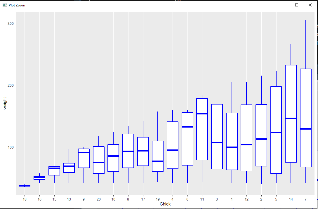
Check out the following to see the actual numbers for Chick ‘7’:

Above, I linked to a blog post which contains a very clear definition of box plot, “A boxplot is a standardized way of displaying the distribution of data based on a five number summary (“minimum”, first quartile (Q1), median, third quartile (Q3), and “maximum”)”.
From the summary function run above, you can see the values for Chick ‘7` are:
- Min: 41.0
- First Quartile: 67.5
- Median: 150.0
- Third Quartile: 226.0
- Max: 305
This matches the chart.
That concludes this introduction to qplot in the ggplot2 library. Insights and distributions can be visualized with a basic filter and minimal arguments.
Categories: R Programming
Leave a Reply