At the end of every quarter, I deliver a usage report which summarizes the historical number of users who visited a page in the Office 365 SharePoint Intranet. The metrics data and graphics are created by exporting the Office 365 SharePoint Usage Report, and then I remove weekend usage information using the Excel Weekday function before generating final counts and related charts. The main summary looks something like this:

I also strip out holidays and other outliers that will incorrectly skew the report. Basically, the client doesn’t care about weekend utilization, nor do they care about Office 365, SharePoint, or Intranet usage during holidays, company “all-hands” days, etc. Below I cover how to export the Office 365 SharePoint Usage Report as well as how to use Excel to quickly filter out weekend data by using the Weekday function.
Office 365 SharePoint Usage Report
To export the report data, which is specifically the number of users who visited a SharePoint page over the last quarter, do the following:
- Navigate to the Microsoft 365 Admin Center
- Choose “Usage” under the “Reports” category

- Now, locate and click on the “SharePoint files” tile

- After you’re redirected to the results page, set the range to 90 days, leave only “Visited a page” selected in the legend filters, and then click “Export”

The last step will generate a Microsoft Excel workbook containing the necessary report data. I strip it down to just the “Report Date” and “Visited Page” columns. Then convert to a table using the shortcut for creating tables.

You can see immediately how keeping data from 3/17, 3/16, 3/10, etc. (i.e. weekends) would skew the report in an unwanted way. These columns can be easily identified and filtered out using the Microsoft Excel Weekday function.
Using Microsoft Excel Weekday
To identify the weekends, create a new column in the table cell C1 – “Day of Week” for example. Then, in cell C2, add the Excel Weekday function as follows:
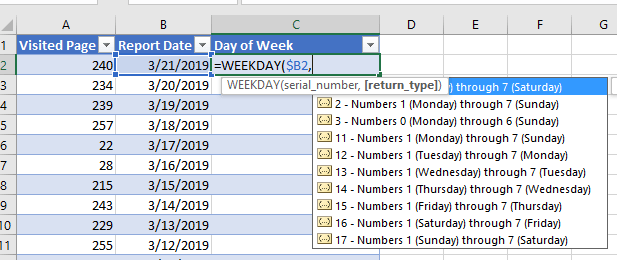
I prefer return_type of style 1, where Sunday is represented by numerical value 1 and Saturday by numerical value 7. As you work with the function, you’ll determine your own preferences and those which work best with your coworkers who may also leverage the data. After entering the function, you’re now left with:

From here you can now simply filter out the data using the table filter drop-down in the Day of Week heading by unchecking “1” and “7”:

At this point you’ve successfully exported the Office 365 SharePoint Usage Report data and have removed unwanted values using the Microsoft Excel Weekday function. You can now move on to create your charts and build the final report.
Categories: Business, Microsoft Excel, Office 365 and O365, SharePoint
Leave a Reply